How to design responsive page for various media
Printed From: openElement Website
Category:
openElement
Forum Name: openElement General Discussion
Forum Description: A place for general discussion and questions about the software.
URL: https://forums.openelement.uk/en/forum_posts.asp?TID=1859
Printed Date: Apr 19 2024 at 12:57pm
Software Version: Web Wiz Forums 12.04 - http://www.webwizforums.com
Topic: How to design responsive page for various media
Posted By: TC2020
Subject: How to design responsive page for various media
Date Posted: Jul 26 2021 at 9:31pm
|
I would like to know how to layout a responsive web page that would display properly on various screen resolutions. I am seeking both general design concept and OE how-to's. My page is a dashboard type, designed primarily for large screens but it has to display properly on smaller screens too: 1). On large screen, the page should look like having 3 columns. The left column has 4 'boxes' in vertical arrangement (4x1), middle column with 10 boxes (4 rows arranged in logical groups as 1x3, 1x3, 1x2, 1x2), and the right column with 3 boxes (3x1). 2). On small screens (smart phones), the page displays all boxes in 1 column (17x1) 3). On medium size (tablets/laptops), the page displays boxes in mixed format depending on the screen size. This can be a single column for boxes inside left column and right column. For the middle column, the boxes can be either in single vertical or (1x3, 1x3, 2x2) or other arrangements as long as it is legible. I started out with creating 3 containers for these columns with proportional % widths, all in relative mode. With this and when the browser resizes slightly, the overall look changes significantly and the box groupings no longer look logical as intended. I decided to change to left container and right container. Left container is still the left column while the right container now contains both the middle and the right columns. The widths are 30% and 68% respectively. With this layout, the display appears to retain that logical groupings as the browser resizes. I first used the OE 3 default media found under Page/Responsive/Edit medias to edit my page to fit those medias. What looks to be proper on the editor for Smartphone does not really display properly on my smart phone; e.g. a singe line text label appears as two lines on my phone and the input text box goes to the next line instead of on the same line. I assume this has to do with my phone resolution and the default responsive breakpoints set by OE medias. This lead me to gather information from reports on popular screen resolutions. I tabulated those responsive breakpoints along with min-max pixels to apply to OE (Page/Responsive/Edit medias/Ajouter/modifier un media), as follows: 3840x 2160 Desktops: 3840 - 4095 2560×1440 Desktops: 2560 - 3839 1920×1080 Desktops: 1920 - 2559 1680×1050 Desktops: 1680 - 1919 1600x900 Desktops: 1600 - 1679 1536×864 Desktops: 1536 - 1599 1440x900 Desktops: 1440 - 1535 1366×768 Desktops: 1366 - 1439 1280×720 Tablets: 1280 - 1365 1024×1366 Tables: 1024 - 1279 800×1280 Tablets: 800 - 1023 768x1024 Tablets: 768 - 799 600×1024 Tablets: 600 - 767 414x896 Smart Phones: 414 - 599 375x812 Smart Phones: 375 - 413 360×640 Smart Phones: 360 - 374 For this dashboard page, I am going to layout the page to support all breakpoints above one by one. For other pages (and there many), I may just use some representative breakpoints. Here are the questions: 1). The min-max pixel range definitions in OE Edit media/Display in editor tab appear odd (0-480, 481-767, 768-1199). I understand these are defined as consecutive steps that browser switches to when it resizes. Should the range mins be the desired breakpoints (as I listed above - 360, 375, 411, etc..) since the editor shows the min size width?. 2). Following on the above, is it true if what looks proper in the editor should appear in the same format up to the defined max px screen?. e.g. a text label and input box on the same line on the min px screen will be on the same line on all screens up to the defined max px screen?. 3). Does the editor show representative or very close to actual look of what to be displayed on an actual screen?. How do I test/emulate this?. 4). My page is now designed for big screen. To fit in smaller screens I have to move things around. Will the change made for one screen size affect other screen sizes?. What things should I watch out for?. My page is now at 30% and 68% for two containers. How should I change those for smaller screens?. Should I move the boxes out of containers to fit the new screen?. 5). Is there a way to tell browser to use the specific breakpoint layouts instead of resizing it when the resolution is in the min-max range?. 6). Does OE keep inheritance (if yes, what properties and any exceptions) among screen resolutions or it simply follows what being designed in each?. What are your recommendations to handle the design requirements above?. Thank you!. |
Replies:
Posted By: Hobby001
Date Posted: Jul 27 2021 at 1:32am
|
You can express width in % or fixed size You can use Media Edition to change size according to screen size You can create your own media size int Media Edition You can strategically group elements to make them react properly to screen size. You can express text size in em units You can use media query CSS code In some cases OE does not display the exact result and you have to use a browser to see it. ------------- https://denislafrance.net/index.en.php" rel="nofollow - https://denislafrance.net https://www.youtube.com/playlist?list=PLWg7A6YtIr7WE2oJe9pX8_3u0FerqJwjo" rel="nofollow - , OE training video |
Posted By: Hobby001
Date Posted: Jul 27 2021 at 1:13pm
They were
defined to fit devices such as standard screen,
1920 x 1080, tablets and cell phones.
You can create as many as you want
If you
absolutely need to maintain the two elements on the same line, you will need to
resize them on smaller devices. The
Media editions are there to make it easier for users. To be more precise you should use CSS media
queries
There are sites available for that such as this one: https://responsivedesignchecker.com/" rel="nofollow - https://responsivedesignchecker.com/
Well, you
should plan for all the desired situation and use media queries or media
edition but you will seriously have to plan.
Unless you use screen related dimensions like % for elements other than
text and em for text but em does not display on editor
Media
queries / media editions creates screen ranges that the browser will use to
display elements <F12> in many browsers such as Chrome offers some possibilities
Inheritance
comes from HTML concept OE simply use it
It seems like you are somone who can study and learn from experience. You should seriously study CSS to be able to handle all your specs. CSS allow to control not only sizes but also animations. You may aso take advantage of javascript programming. You can search the net for all sort of tips and tricks. (that's how I learned) ------------- https://denislafrance.net/index.en.php" rel="nofollow - https://denislafrance.net https://www.youtube.com/playlist?list=PLWg7A6YtIr7WE2oJe9pX8_3u0FerqJwjo" rel="nofollow - , OE training video |
 TC2020 wrote:
Posted By: TC2020
Date Posted: Jul 27 2021 at 5:43pm
|
Before posting this thread, I created all the responsive breakpoints as I listed above with min and max values as well as media query modification in the code box (e.g. only screen and (max-width: XXXpx)) via Page/Responsive/Edit medias. I also experimented with many of these breakpoints by rearranging elements on my page to fit in specific screen sizes. In doing so, I found certain changes for specific screen do have effect on other screens. Most of my elements are defined using % and they look right on large screen. If I increase this % for certain element on a smaller screen, this also reflects back on the large screen (it's not desirable and basically I was going around in circle). This lead to my many questions in this post to get better understanding on how OE works in this situation, such as inheritance or WYSIWYG per individual screen layouts. My page has boxes for tables, boxes for graphs, boxes for text, as well as images that I would like to maintain their logical groupings. I will continue experimenting with different arrangements and see how they fit. W3 is my go-to for various tips and I will look into media queries in more details. I assume the code box does not need "@media" but only "only screen and (max-width: XXXpx)" as shown by the default settings already there. Thanks for taking time to respond. |
Posted By: Hobby001
Date Posted: Jul 28 2021 at 2:10am
You can define a range instead of a max------------- https://denislafrance.net/index.en.php" rel="nofollow - https://denislafrance.net https://www.youtube.com/playlist?list=PLWg7A6YtIr7WE2oJe9pX8_3u0FerqJwjo" rel="nofollow - , OE training video |
Posted By: TC2020
Date Posted: Jul 28 2021 at 11:27pm
|
I have a text box with text set to large/18px font in my Default media view. When viewed the page on an actual laptop with 1366x768 resolution, this text appears relatively big. I changed this text to 14px font via OE Page/Responsive/Edit medias/Desktop 1366 (my breakpoint for 1366px-1439px screens). I just want to apply this change to this screen breakpoint only. However, OE also applied it to Default media as well as the rest of screen breakpoints. What did I do wrong and how to correct it?. Thanks. |
Posted By: Hobby001
Date Posted: Jul 29 2021 at 2:54am
|
Can you copy / paste what you enterred in Media Edition? ------------- https://denislafrance.net/index.en.php" rel="nofollow - https://denislafrance.net https://www.youtube.com/playlist?list=PLWg7A6YtIr7WE2oJe9pX8_3u0FerqJwjo" rel="nofollow - , OE training video |
Posted By: TC2020
Date Posted: Jul 29 2021 at 3:20am
|
How do I attach an image to this post, so I can show you the screenshots?. |
Posted By: TC2020
Date Posted: Jul 29 2021 at 3:25am
|
What is Default media based on?. Is it my monitor screen resolution that OE reads and uses for it?. |
Posted By: TC2020
Date Posted: Jul 29 2021 at 4:13am
|
Below is what I entered in OE Page/Responsive/Edit medias/Ajouter modifier un media/Configuration of medias boxes according to the headings below: Name of the media Code Min-Max Width (Resolution) ================= ==== ============= ============ Desktops 3840 only screen and (max-width: 4095px) 3840 - 4095 3840x 2160 Desktops 2560 only screen and (max-width: 3839px) 2560 - 3839 2560×1440 Desktops 1920 only screen and (max-width: 2559px) 1920 - 2559 1920×1080 Desktops 1680 only screen and (max-width: 1919px) 1680 - 1919 1680×1050 Desktops 1600 only screen and (max-width: 1679px) 1600 - 1679 1600x900 Desktops 1536 only screen and (max-width: 1599px) 1536 - 1599 1536×864 Desktops 1440 only screen and (max-width: 1535px) 1440 - 1535 1440x900 Desktops 1366 only screen and (max-width: 1439px) 1366 - 1439 1366×768 Tablets 1280 only screen and (max-width: 1365px) 1280 - 1365 1280×720 Tablets 1024 only screen and (max-width: 1279px) 1024 - 1279 1024×1366 Tablets 800 only screen and (max-width: 1023px) 800 - 1023 800×1280 Tablets 768 only screen and (max-width: 799px) 768 - 799 768x1024 Tablets 600 only screen and (max-width: 767px) 600 - 767 600×1024 Smart Phones 414 only screen and (max-width: 599px) 414 - 599 414x896 Smart Phones 375 only screen and (max-width: 413px) 375 - 413 375x812 Smart Phones 360 only screen and (max-width: 374px) 360 - 374 360×640 Going from 360 up, each breakpoint is separated by 1px from the min width of the next higher breakpoint. I decided to use the popular resolution as the min width (e.g. 360, 375, 411, etc...) and lay out my page to fit this min width, thinking that it will fit properly in anything higher in the range. So far this proves to be correct. As mentioned earlier with a text box example, my change in one breakpoint applied to all breakpoints including Default media. I hope it will not, and it's just my own doing or lack of. Otherwise I would be just going around in circle to fix something and break others. I am going to watch your tutorial videos again wrt changes in OE tablets/smart phones medias. Thanks for all your help so far. |
Posted By: TC2020
Date Posted: Jul 29 2021 at 4:28am
|
I guess there is no direct image paste to post here, but through link. Let me try this (as in your way). http://https://zupimages.net/viewer.php?id=21/30/8ghg.png" rel="nofollow - http://https://zupimages.net/viewer.php?id=21/30/8ghg.png http://https://zupimages.net/viewer.php?id=21/30/hvrp.png" rel="nofollow - http://https://zupimages.net/viewer.php?id=21/30/hvrp.png |
Posted By: TC2020
Date Posted: Jul 29 2021 at 4:37am
|
...extra http:// removed from previous post. Let's try these: http://https://zupimages.net/viewer.php?id=21/30/8ghg.png" rel="nofollow - https://zupimages.net/viewer.php?id=21/30/8ghg.png http://www.zupimages.net/viewer.php?id=21/30/hvrp.png" rel="nofollow - https://www.zupimages.net/viewer.php?id=21/30/hvrp.png |
Posted By: Hobby001
Date Posted: Jul 29 2021 at 11:20am
|
To post an image go to the full replay editor https://zupimages.net/viewer.php?id=21/30/uifn.png" rel="nofollow"> 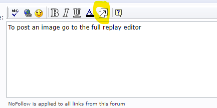 Then insert image https://zupimages.net/viewer.php?id=21/30/z09k.png" rel="nofollow"> 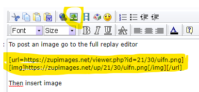 The image must be hosted on the WEB
------------- https://denislafrance.net/index.en.php" rel="nofollow - https://denislafrance.net https://www.youtube.com/playlist?list=PLWg7A6YtIr7WE2oJe9pX8_3u0FerqJwjo" rel="nofollow - , OE training video |
Posted By: Hobby001
Date Posted: Jul 29 2021 at 11:24am
|
Can I get a link to your page?
If not done yet, try adding this to SEO Info and Medias?
https://zupimages.net/viewer.php?id=21/30/s889.png" rel="nofollow">
 ------------- https://denislafrance.net/index.en.php" rel="nofollow - https://denislafrance.net https://www.youtube.com/playlist?list=PLWg7A6YtIr7WE2oJe9pX8_3u0FerqJwjo" rel="nofollow - , OE training video |
Posted By: TC2020
Date Posted: Jul 29 2021 at 5:05pm
|
My page does not have that viewport meta but that declaration may not be helpful because users may need to zoom, especially on phones. This is not a Website on the internet so I need to prepare the pages and provide you the link via your website contact form. There, maybe you will see the issues I am facing.
|
Posted By: TC2020
Date Posted: Jul 29 2021 at 6:09pm
|
My questions so far have to do with my lack of understanding of the 'concept' of how responsive design is implemented in OE, so my question is: Is the responsive design concept in OE based on: 1). WYSIWYG? 2). Element hide/visible setting?. 3). Both of the above, maybe with exceptions For 1), I do not think it is true because change in one media ripples throughout. This may be because I do not do things in the right way? (and I hope this is the case). For 2), I have not tried yet but from the tutorial videos, it looks like you either show or hide elements on specific screen size so they look proper. Effectively you would have multiple copies of the same element on a page and selectively show or hide it depending on the screen size. For 3), maybe 1) is true except certain properties that inherit from parent pages I hope the above makes some sense and relatable. Knowing the concept helps avoid senseless trials and errors. Thanks. |
Posted By: Hobby001
Date Posted: Jul 30 2021 at 4:57am
They stopped trying to make it 100% WYSIWYG when the number of screen size and resolution grew too fast. You rely on previsualisation on browswers to control what you have done <F12> in Chrome offers some possibilities
Never needed to double an elemement, simply used media edition properly to reconfigure the element. Hiding and display elements is required sometime for other reasons. In the responsive menu tutorial it is hidden on smaller devices and replaced by the "hamburger" button used to call (display the menu) The menu items are then reconfigured for finger accessibility on these smaller devices.
By parent pages, y ou meant layers I guess
If you could zip a copy of your project with some pages not necessarily the whole project I would be in a better position to understand what you have done. Just send me the link trough WEtransfer.com they can generate a lnink that you can send me trough my contant page: https://denislafrance.net/index.en.htm#Contact" rel="nofollow - https://denislafrance.net/index.en.htm#Contact
------------- https://denislafrance.net/index.en.php" rel="nofollow - https://denislafrance.net https://www.youtube.com/playlist?list=PLWg7A6YtIr7WE2oJe9pX8_3u0FerqJwjo" rel="nofollow - , OE training video |
Posted By: TC2020
Date Posted: Jul 30 2021 at 4:57pm
|
WEtransfer.com asks for recipient's email address and I do not know yours. I already sent the link through your contact form. Please check. As mentioned, this is not an internet website but for a device. To access it, I would need your IP address to open its firewall for you. Also mentioned, you can send me your IP via my email in your contact form or via pigeons... |
Posted By: TC2020
Date Posted: Jul 30 2021 at 5:19pm
|
I do use Chrome to check my page. I set it to include all my screen resolutions above. In case someone wants to know... This is done by clicking the 3 vertical dot button at top right hand corner of Chrome. It opens up a menu. Click on More tools ->Developer tools. This opens up a window which you see 'Responsive' at the top. Click on that and drop down to 'edit...'. In that new panel, I entered all my resolutions and their labels with prefix such as Ax, Bx, Cx (x=[0..N]) for desktops, tablets, phones. This way, the drop down list will list the resolutions from large to small in proper order (so it's faster to check your page in going down the list). With all required resolutions pre-defined, it's quicker to check the page. Otherwise, it's very tiresome from the process. |
Posted By: TC2020
Date Posted: Jul 30 2021 at 7:00pm
|
I already sent you the WEtransfer link to the source file. Please check. |
Posted By: Hobby001
Date Posted: Jul 30 2021 at 9:37pm
|
Ok, I see the issue, The media query editor does not write the min width code For example your criteria seems to be only screen and (max-width: 767px) plus min-width: 600px. But the editor provides only screen and (max-width: 767px) You will have to manualy edit the code to change it into only screen and (max-width: 767px) and (min-width:600px)
------------- https://denislafrance.net/index.en.php" rel="nofollow - https://denislafrance.net https://www.youtube.com/playlist?list=PLWg7A6YtIr7WE2oJe9pX8_3u0FerqJwjo" rel="nofollow - , OE training video |
Posted By: Hobby001
Date Posted: Jul 30 2021 at 10:12pm
|
To tell you the truth, I use to write the code directly in the editor, It's easier for me than relying on the graphical interface you just demonstrate that does not work 100% ------------- https://denislafrance.net/index.en.php" rel="nofollow - https://denislafrance.net https://www.youtube.com/playlist?list=PLWg7A6YtIr7WE2oJe9pX8_3u0FerqJwjo" rel="nofollow - , OE training video |
Posted By: TC2020
Date Posted: Aug 03 2021 at 7:47pm
|
After trial and error over the last couple days, I got this page responsive to all my screen resolutions as listed in previous post and elements lined up in my dashboard. I think the key concept goes back to the use of % for dimensions (as emphasized in many videos). It is also important to avoid using Min width based on pixels as it makes things harder to work with especially when the page is designed in columns (say, two with 20% and 80%). If this min px is smaller than the px size derived from the assigned % width, then the % value dictates the width (on large screens). When min px becomes dominant (on smaller screens), then the assigned % numbers (for multiple column widths) are of no use and can mislead you because the real % on certain screen size is then the ratio of min px and screen width resolution. At this point things start to shift around and you may wonder why they do not align as you expect (e.g. 20%-80%). I used this min width in px and it was one of the reasons that I had many difficulties in understanding responsive design in OE. This is not because of OE but it's on how things work. It tends to be overlooked during design. Having said that, OE is not always WYSIWYG and is misleading. Its editor window does not reflect your media size even though it displays the pixel size. Also, the editor does not tend to auto update on every change, so a page refresh is needed to really see the effect. If not, it can be very misleading. I use Chrome developer Options (F12) to check overall display on specific display size and also online tool (such as whats-my-browser-size) to check actual width. I checked my page on some actual devices and they look very close to what being shown by these two tools. I posed a question earlier on what OE Default media refers to (as some reference to proportionally lay out the structure for my dashboard). I thought it referred to my monitor resolution (3840x2160) but I think it's the browser resolution. So I have been designing my page with 2048x1017 instead. I still have many things to figure out with OE but overall, I think OE is a very good tool for someone like me to do responsive web page. It would be great to have tutorials to illustrate various responsive design concepts with respect to media resolutions, px, %, etc..and how-to's dealing with OE element property settings to help users reduce trial and error, if possible. Thanks to Hobby001 for all your help. |
Posted By: Hobby001
Date Posted: Aug 04 2021 at 2:00am
|
As I could see in your project, you have very specific requirements. Only few individuals needs to work with such a resolution (3840x2160) I don't thik that you can find something free for that. ------------- https://denislafrance.net/index.en.php" rel="nofollow - https://denislafrance.net https://www.youtube.com/playlist?list=PLWg7A6YtIr7WE2oJe9pX8_3u0FerqJwjo" rel="nofollow - , OE training video |
Posted By: digizar
Date Posted: Aug 05 2021 at 6:01pm
|
Yes, and it would cause a tremendeous amount of data accross the internet. Which sucks a contingent away with the first image. Despite a possblle very long download time. The customer would definitively not be much excited.
------------- ___________________________________ Ask questions only if there is no answer yet. https://blumendigi.com |
Posted By: Hobby001
Date Posted: Aug 05 2021 at 7:22pm
In fact their requirement is for private internal network app ------------- https://denislafrance.net/index.en.php" rel="nofollow - https://denislafrance.net https://www.youtube.com/playlist?list=PLWg7A6YtIr7WE2oJe9pX8_3u0FerqJwjo" rel="nofollow - , OE training video |
Posted By: TC2020
Date Posted: Aug 06 2021 at 6:31pm
|
It seems there is some misunderstanding on the reference to 3840x2160 resolution. And no, it was not my goal to design a Web page to this resolution (but only to popular screen resolutions based on 2020/21 statistics out there). This resolution was brought up as a way to figure out what OE 'Default media' actually refers to since we always work with Default media. As mentioned earlier, I think it's good to know what it is so you can plan your page to have a 'good' proportion (maybe, width/height=1.618) as a start. My page is a dashboard with some logical groupings and I want to keep them as close to what I design on the Default media as possible for all resolutions. Dashboard provides an effective (and popular) means for data visualization with tables, graphs, images, etc... It requires certain level of precision in laying out the Web page and it can be done with OE. OE is a good tool. It is just short on documentation, so a lot of guessing and figuring out to use it (at least for me anyway)... and still many things to learn as I go along with OE. |